Sometimes, people just need an extra push to get them to do what you want them to. The right call to action, or CTA, can help you increase your conversion rate and ultimately improve your bottom line!
In this article, we’re going to outline some tips for adding effective CTAs to your website. Let’s get started.
Make Them Bright And Bold So They Attract Attention
The design of your CTA is just as important as the wording! If your CTAs are poorly designed or blend into the background, readers might not spot them. So, you need to put some thought into making them stand out!
Place your CTAs on a button to ensure that they draw the eye of the reader. To make them stand out even more, consider using a bold color so it stands out against the background of your website. This will help ensure that people know where to go to take the action you want them to take.
Let’s take a look at an example of a business that has great standout CTAs on its website for inspiration.
HelloFresh, a popular meal kit subscription service, has a great CTA on its homepage. Notice how the bright green color stands out against the pink background. The button stands out on the page and encourages people to click and view the company’s plans. This makes it a very effective CTA!
On your website, use a color for your CTA buttons that stands out against your background color. This will draw the eye of website visitors, ensuring they see it and making it more likely that they’ll click. This will help increase your conversion rate!
Address Different People With Multiple Calls To Action
Different people who visit your website might be at different stages of their buying journey. To help ensure that they convert, you’ll often want to provide different CTAs that correspond to different stages of the customer buying journey.
Generally, the buying journey has three stages: awareness, consideration, and decision.
- Awareness: The buyer learns they have a problem
- Consideration: The buyer understands their problem and considers their options to solve it
- Decision: The buyer decides on the right provider to solve the problem
It could be worth including multiple CTAs on the same webpage to help you target people at different stages of the buying journey.
Let’s take a look at an example of a business that has multiple CTAs on their webpage for inspiration.

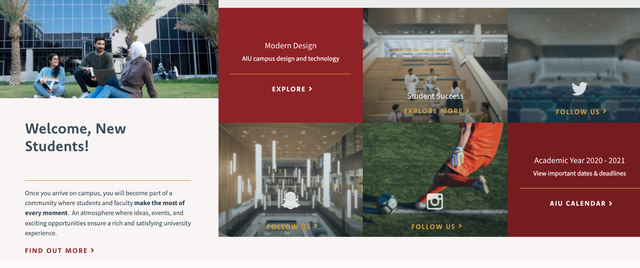
American International University, a higher education institution in Kuwait, has CTAs that target people at different stages of the customer journey on their Career Center page. Take a look at the image above and notice how they have CTAs to “explore” the campus, “find out more”, and follow them on social media. The explore CTA is great for people who haven’t seen the institution’s campus yet, while “find out more” is great for people getting ready for their student orientation. The “follow” CTAs, on the other hand, are great for people like parents, who are just interested in what American International University is doing. All of these CTAs target different types of people — with many groups having their own unique CTA, American International University makes it more likely that each of them will click.
On your website, use multiple CTAs to target different types of people. This will make it more likely that they’ll click, as their needs will be targeted directly. This can make your CTAs more effective and will help you improve your conversion rate.
Try To Create A Sense Of Urgency
If you create a sense of urgency with your CTAs, you can make consumers feel like they’ll miss out if they don’t act immediately. This will help you improve your sales!
One easy way to create a sense of urgency is to simply add “now” to the wording of your CTA. This indicates to the reader that they should take your desired action immediately. You can also incorporate phrases like “limited time only” or add a timer that indicates how long a particular sale is running. This will make the reader feel like they might miss out if they don’t act quickly, increasing your conversion rate.
Let’s take a look at an example of a business that incorporates urgency into their CTAs for inspiration.
MVMT, an American watchmaker and accessory retailer, creates a sense of urgency using the CTA on their homepage. In the image above, notice how their CTAs say “Shop Now.” This is much more effective and urgent than just the word “shop” would be. It clearly tells the reader that they should shop immediately, making it an effective CTA.
On your website, incorporate urgency into your CTAs, as MVMT has. Don’t be afraid to be direct — this will help get your website visitors to take the action you want them to take. Incorporating urgency into your CTAs will help encourage clicks and grow your sales.
Highlight If You’re Offering Something For Free
Everyone loves free stuff! So, if you’re creating a CTA to promote something to your reader that won’t require them to spend money, make that very clear. This strategy can work if you’re offering the likes of free templates, free trials, and free consultations.
Offering something free is a great marketing tactic in general — it can help show prospective customers what you’re capable of doing as a business. This will help lead to people spending money with you in the future.
Let’s take a look at a few examples of businesses that highlight their free offers in their CTAs for inspiration.
Highest Cash Offer, a real estate solutions company, has a great CTA on its service page for selling water-damaged homes. To the right of the page, their CTA says “get a FREE no-obligation offer!”. All a user has to do is plug in their email address and they’ll be able to get started. By highlighting that users don’t have to spend money to receive an offer, Highest Cash Offer can encourage more people to click, making it a very effective CTA.
On your website, highlight if your customers can get started with you without spending money in your CTAs. This will make getting started with your business much more enticing and encourage people to convert. It’s likely this will ultimately help you increase your bottom line!
Paramount Plus, a streaming service, also highlights their free trial on their homepage. As you can see in the image above, there is a bright blue button that tells a user they can try the service for free. By clicking the CTA, the user is taken to the signup page and can get started. By highlighting their free trial in their call to action, Paramount Plus can encourage clicks and get the results they want.
On your website, be sure to highlight any free trials you can offer in your CTAs. This will entice your website visitors to click and get started with your company, making it a highly-effective CTA strategy that will help make you money in the long run.
Inject Some Personality Into Your Calls To Action
You want prospective customers to really engage with your CTAs, and injecting some personality into them can really help!
Having a strong brand voice is very important for your branding strategy in general. To identify yours, think about how your ideal customer likes to be spoken to. Do they expect you to have fun or be strictly professional? What are other brands in your niche doing? Thinking about the expectations in your field will help you determine what your brand voice should be.
Let’s take a look at an example of a business that incorporates their personality into their CTAs for inspiration.
Man-Pack, a retailer of men’s sling bags, infuses their personality into the CTA on their homepage. Take a look at the image above and you’ll see that the CTA here says “build a ManPack”. Though the phrasing is short and sweet, it does a good job of showing the company’s personality. “Build” is a much more masculine and evocative word than just “buy” or “shop”. This shows a lot about Man-Pack’s personality — they’re talking to manly men! This will help encourage their ideal customers to click.
Infuse some personality into your own CTAs. Use words and phrases that tell website visitors more about who you are as a company. Think about how they would want to be spoken to, as well — this will help encourage them to click, making for more effective CTAs that ultimately increase your sales.
Summary
The right CTAs can help you get more subscribers, increase your sales, and ultimately make you more money. In this article, we outlined different tips for creating strong CTAs, including creating a sense of urgency and expressing your brand personality.
Need more business help? Check out the Techdee blog. They have articles on customer service, content marketing, and more.
—
Author bio & headshot:
Adam Steele is COO and co-founder of Loganix, which is an SEO fulfillment partner for digital marketing agencies and professionals. The company provides the SEO services that businesses need to grow and achieve their goals. If you enjoyed this article, you can find more SEO guides and templates on the Loganix blog.
